
Hi, readers! I hope everyone is doing well and staying sane. I was trying to think of a top ten list to do, and I realized that I had a suggestion from another blog regarding favorite covers, so I thought I'd combine them. The blog the suggestion came from can be found here. This was a surprisingly easy list for me to come up with. I'm guilty of judging books by covers, and this was pretty fun to figure out. Some of these books I've read, some I haven't. Feel free to let me know what your favorite book covers are!
1.)
1.)

If you've read this blog for any length of time, you probably know this is one of my absolute favorite series. Not only is it a great book to read, but I absolutely adore the cover. It's simple, but it still has so much detail. I feel like there are some optical illusions with this cover, and I just enjoy it so much. I could have put the second and third book on the list as well but decided that'd be too easy.
2.) 

I haven't read Children of Blood and Bone by Tomi Adeyemi, yet. I'll probably pick it up here soon because I can't stop thinking about this cover. I absolutely love the contrast in it. I've read the book description multiple times, and I don't remember what it's about, but the cover alone makes me want to read it.
3.) 
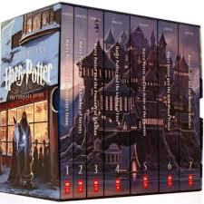
This isn't so much the cover as much as what the books look like when they're together. I have a Harry Potter set. They're in a Hogwarts chest, and I refuse to actually take them out or read them, so they don't get dirty. When I reread them, I always just read them on my kindle. I love this set, though. I think it's so cool that they form Hogwarts when lined up in order. I need it.
4.) 

I love this cover. It's more of a tie with #3. I think it's one of the better book covers I've seen. I just wish I would have enjoyed the book more.
5.) 

I love the color contrast in this cover. I think the black scales just make the dragon's eye stand out. The font is really cool too. I think all of the covers in the series are similar, and it's available on Kindle Unlimited. I need to read the rest of the series.
6.) 

I got Fiend back in the days when I was on websites that provided free books for reviews. I wish I still had the paperback version of this. Not only is the color combination just different, but it had a weird texture. The book is about drug addicts being the only people to survive the zombie apocalypse, and it feels gritty. I've always thought that was kind of unique.
7.) 

I love this series, black and white photography, and creepy things. The entire series is centered around creepy old photographs that Ransom Riggs has acquired over the years. I just really enjoy the black and white contrast on this cover. Plus, it's kind of strange.
8.) 

This is another series where I could have honestly listed most of the covers in the series. I love the colors on this cover. But mostly, I feel like it looks like a book where you're told not to open it, and all hell breaks loose if you do. I dig the journal vibe.
9.) 

I just realized I had a missed opportunity to use this on the challenge for a book with a building on the cover. Anyways, I just read this book, and I feel like the cover is an absolutely perfect fit. I think the artwork has a ton of detail, and I love the bloody crown. I think this has a lot of similar vibes as The Red Queen. Maybe it's the red font on silver with the bloody crown.
10.) 

I think The Hangman's Daughter has a handful of covers, but I love this one. I've read a little bit of the book and then lost it. I keep meaning to acquire it again and finishing it. I just love the red on black with gold details. It has an overall Gothic aesthetic that I absolutely adore.
No comments:
Post a Comment
Thank you for reading my book blog. Please feel free to leave a comment to further or start a discussion on the book reviews and other posts. If you have a book recommendation for me, I would love to hear it!